The Surprising Role of Neuroscience in Next-Gen UX
17 August 2026
For years, user experience design has been a discipline driven by observation. We watch users, ask them questions, run A/B tests, and analyze heatmaps. We infer what they want based on behavior. But behavior is only the output. The input, the actual cognitive and emotional machinery that drives every click, hesitation, and frustration, has remained largely opaque. That is changing. Neuroscience is moving from the lab into the design studio, and it is not just about fancy EEG headsets or eye-tracking goggles. It is about fundamentally rethinking what we design for: not the user as a rational actor, but the user as a biological system trying to conserve energy.
The next generation of UX will not be judged by how intuitive an interface looks, but by how seamlessly it aligns with the brain's hardwired processing limits. This article explores the specific neural mechanisms that matter most to designers, why they matter, and how to apply them without falling for the hype.

The Brain Is Not a Computer, It Is a Prediction Engine
The most common misconception in tech is that the brain processes information like a CPU: input, process, output. In reality, the brain is a predictive organ. It is constantly generating models of what will happen next and comparing them to actual sensory input. When reality matches the prediction, you feel a sense of flow. When it does not, you experience a spike in cognitive load and a release of stress hormones.This has a direct consequence for UX. Every time a user has to figure out where a button is, or why a page loaded differently than expected, their brain registers a prediction error. Small errors are annoying. Large errors cause users to abandon the task entirely. The best interfaces are those that confirm predictions at every step. This is why consistency in design systems is not just a visual preference; it is a neurological requirement.
Consider the hamburger menu. On mobile, users have been trained to expect it. But on desktop, where a visible navigation bar is the norm, the hamburger icon forces the brain to pause and ask, "What is this?" That pause is a prediction error. It costs milliseconds, but it also costs trust. The next-gen UX approach is not to ask whether users can learn a pattern, but whether they should have to.
Cognitive Load Is a Currency, and You Are Overspending
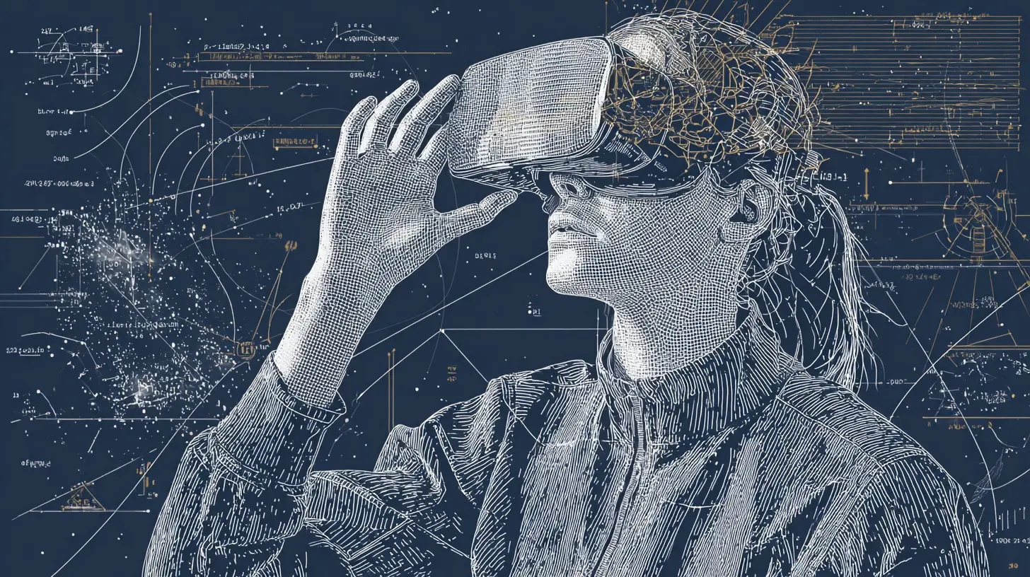
Cognitive load is the total amount of mental effort being used in the working memory. It has three types: intrinsic (the complexity of the task itself), extraneous (the way information is presented), and germane (the effort to build a mental model). Most UX designers focus on reducing extraneous load, which is good. But they often ignore intrinsic load, which is a mistake.If a task is inherently complex, like configuring a firewall or editing a video timeline, no amount of visual simplification will make it easy. What neuroscience suggests is not to simplify the task, but to offload the cognitive work to the environment. This is called distributed cognition. Instead of making the user remember settings, show them a live preview. Instead of asking them to recall a previous step, show a breadcrumb trail.
A real-world example is the difference between a command-line interface and a graphical one. The command line requires the user to hold syntax, flags, and file paths in working memory. The GUI offloads that to visual menus and icons. But many modern apps have regressed by burying features behind multiple layers of settings. The brain sees a maze, and the default response is to quit. The best practice is to ask, "What is the minimum amount of information the user must hold in their head to complete this action?" Then design to that minimum.

The Role of the Basal Ganglia and Habit Formation
The basal ganglia is a group of nuclei in the brain associated with habit formation, procedural memory, and action selection. When you perform a task repeatedly, the brain encodes it into a chunk, a single neural routine that requires almost no conscious effort. This is why you can type without looking at the keyboard or drive a familiar route while thinking about something else.For UX, this means that the goal is not to make users think less, but to make them think less after the first few interactions. The first use of an app is always cognitively expensive. The second is cheaper. By the tenth, it should be automatic. If it is not, the design has failed to engage the basal ganglia.
This has a practical implication: onboarding should not be a one-time tutorial. It should be a series of spaced repetitions that build procedural memory. A good example is gesture-based navigation. Swiping to delete an email feels unnatural at first. But after a few repetitions, it becomes a habit. The brain has encoded the motion as a single action. The mistake many designers make is to offer multiple ways to perform the same action, like both a swipe and a long-press and a button. This prevents the formation of a single habit. Choose one primary path and stick to it.
Emotional Valence and the Amygdala's Gatekeeping
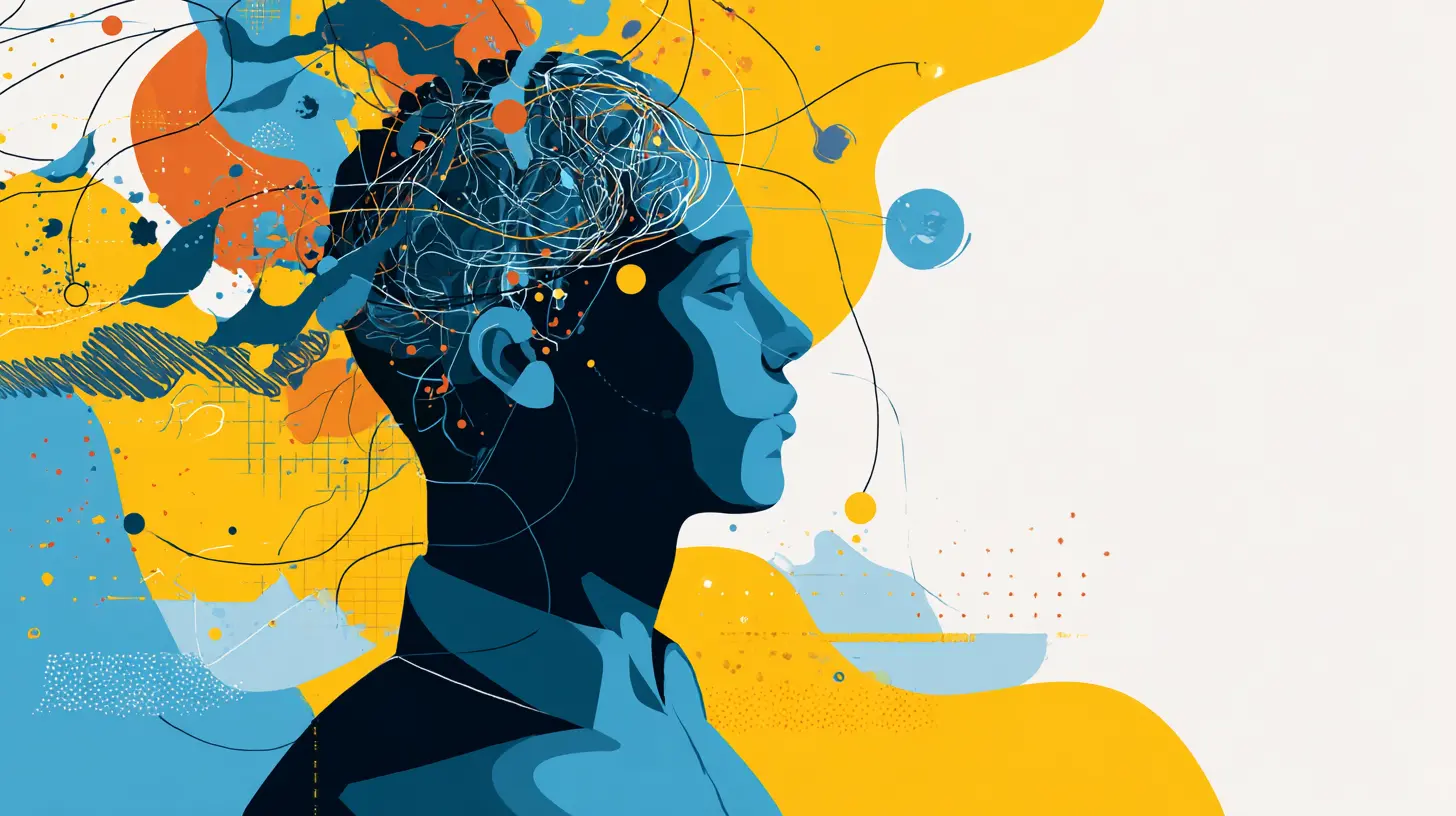
The amygdala is often called the fear center, but it is more accurately the salience detector. It tags incoming stimuli as positive, negative, or neutral. This tagging happens before conscious thought. A user may not be able to articulate why they feel uneasy about a website, but their amygdala has already made a judgment based on color, spacing, and motion.This is why aesthetics are not superficial. A cluttered layout triggers a mild threat response. A slow-loading spinner triggers impatience, which is a form of low-grade anger. Even the choice of font can affect emotional valence. Serif fonts are often perceived as more authoritative, while sans-serif fonts feel more modern. Neuroscience does not dictate a specific style, but it does dictate that emotional response is always active. There is no neutral design.
The practical takeaway is to design for the emotional baseline first, then the task. If a user feels anxious, they cannot access their prefrontal cortex, the area responsible for complex problem-solving. They will default to fight, flight, or freeze. In UX, freeze looks like staring at a blank page. Fight looks like rapid, frustrated clicking. Flight is closing the tab. Before you optimize for conversion, optimize for calm.
Attention Is a Zero-Sum Game
Attention is not a resource that can be multiplied. It is a single spotlight with a narrow beam. The brain can only consciously process about 40 to 50 bits of information per second. A single conversation consumes about 60 bits. This means you cannot truly multitask. You can only switch tasks rapidly, and each switch carries a cost called the switching penalty.In UX, this penalty appears when a user is forced to move between fields, tabs, or windows. Every time they shift focus, the brain has to reorient, re-establish context, and suppress irrelevant information. This can take up to 0.5 seconds per switch. Over a complex form, that adds up to minutes of wasted time and a significant increase in error rates.
The next-gen approach is to design for sequential attention, not parallel attention. Do not put a progress bar on the side while the user is filling out a form. Do not show live notifications while they are reading an article. Instead, create a linear path where each step fully occupies the attention spotlight and then releases it. This is why single-page checkouts often outperform multi-step ones, not because they are shorter, but because they do not force attention to bounce between a summary, a form, and a navigation menu.
The Default Mode Network and the Importance of White Space
When the brain is not focused on an external task, it activates the default mode network (DMN). This network is associated with mind-wandering, creative thinking, and consolidating memories. For a long time, the DMN was seen as a distraction. But recent research suggests it is essential for problem-solving and long-term retention.For UX, this means that white space is not empty. It is where the brain processes what it just saw. If a page is packed with information, the DMN never gets a chance to activate. The user feels overwhelmed because they are forced to stay in a state of focused attention indefinitely. This is exhausting.
The practical application is to design for pauses. After a significant action, like submitting a form or completing a purchase, give the user a moment of visual silence. Do not immediately bombard them with upsells or notifications. This allows the brain to encode the success and build a positive association. Similarly, in content-heavy pages, use short paragraphs, clear headings, and ample margins. The goal is to let the reader's mind wander between sections, which actually improves comprehension.
Working Memory Limits and Progressive Disclosure
Working memory can hold about four chunks of information at once. This is known as Miller's Law, though the number has been refined from the original seven to a more realistic four. The key is that these are chunks, not individual items. A chunk can be a single letter, a word, or an entire concept.This is why progressive disclosure works so well. Instead of showing all options at once, show only the most relevant ones and reveal more on demand. The brain can handle a chunk like "Advanced Settings" as a single unit, but it cannot handle a list of thirty individual settings. By hiding the details behind a disclosure, you allow the user to keep the main task in working memory without overflow.
A common mistake is to use progressive disclosure as a way to hide poor information architecture. If the user has to click through three levels to find a basic feature, that is not progressive disclosure; that is burial. The rule is to expose the 20 percent of features that are used 80 percent of the time, and hide the rest. The hidden features should be grouped logically so that the brain can treat each group as a single chunk.
The Power of Visual Hierarchy and the Prefrontal Cortex
The prefrontal cortex is responsible for executive function, planning, and decision-making. It is also the most energy-hungry part of the brain. When a user is faced with a poorly designed interface, the prefrontal cortex has to work overtime to parse the layout, identify elements, and decide where to click. This is called decision fatigue, and it leads to abandonment.Visual hierarchy is not just about making things look nice. It is about reducing the number of decisions the prefrontal cortex has to make. A clear hierarchy tells the brain, "This is the primary action. This is secondary. This is informational." The brain can then process the page in a single pass. Without hierarchy, the brain has to scan, compare, and evaluate every element, which is a slow and painful process.
The best way to create hierarchy is through size, contrast, and position. But there is a subtlety: the brain is more sensitive to differences in color and motion than to differences in font size. A small red button will draw more attention than a large gray one. This is a double-edged sword. If you use high-contrast colors for everything, nothing stands out. The brain will eventually stop responding to the salience cues. Use contrast sparingly, and reserve it for the single most important action on the page.
Neuroplasticity and the Myth of the Digital Native
There is a persistent belief that younger users, the so-called digital natives, have brains that are fundamentally different from older users. This is false. Neuroplasticity, the brain's ability to reorganize itself, exists at all ages. What differs is the familiarity with specific patterns, not the underlying cognitive architecture.A digital native may be faster at recognizing a swipe gesture because they have more practice. But they still suffer from the same working memory limits, the same prediction errors, and the same decision fatigue. The implication is that you cannot rely on generational assumptions. You must design for the cognitive baseline, which is universal.
This also means that users can learn new patterns, but only if the learning curve is gentle enough. The brain resists change because change requires energy. To encourage adoption, you must provide immediate rewards. If a new gesture saves time, the brain will notice the reward and update its predictions. If it does not, the brain will revert to the old pattern. This is why forcing users into a radically new interface without a clear benefit is a recipe for failure.
Practical Frameworks for Applying Neuroscience
You do not need to buy an EEG machine to apply these principles. You just need to change how you evaluate your designs. Here are three frameworks that work in practice.First, the prediction audit. Before a user interacts with a new interface, ask what they expect to happen. Write down those expectations. Then test the interface and note where reality diverges from expectation. Every divergence is a point of friction. Fix the biggest divergences first.
Second, the cognitive load budget. For any given task, estimate the number of chunks the user must hold in working memory. If it is more than four, break the task into smaller steps. If you cannot break it down, provide external memory aids like checklists, progress indicators, or persistent summaries.
Third, the emotional checkpoint. After a critical interaction, ask the user how they feel, not what they think. Feelings are faster and more accurate indicators of the amygdala's response. If the user feels confused, anxious, or annoyed, the design has failed at the neural level, regardless of whether they completed the task.
Common Mistakes and Misconceptions
One of the biggest mistakes is treating neuroscience as a source of rules rather than a source of insight. There is no "neuroscience-approved" button color. There are only principles about contrast and salience. Another mistake is over-engineering for cognitive load reduction to the point of stripping away all context. A blank page with one button is not minimal; it is disorienting. The brain needs context to form predictions.A common misconception is that eye-tracking tells you where attention is. It tells you where the eyes are pointing, which is not the same as where attention is. You can look at something without processing it. This is called inattentional blindness. The real question is not where the user is looking, but what they are encoding into memory. To measure that, you need to test recall and recognition, not just gaze.
Another misconception is that faster is always better. The brain needs time to process. If a page loads in 0.1 seconds, the user may not have time to register that a transition occurred. This can actually cause confusion. A brief, intentional delay, like a 200-millisecond transition, can help the brain track the change. This is why some animations improve UX while others degrade it. The difference is whether the animation supports the brain's prediction or contradicts it.
The Future of Neuroadaptive Interfaces
The next frontier is neuroadaptive interfaces, systems that adjust in real time based on the user's cognitive state. This is already being tested in automotive and aviation settings, where systems monitor driver fatigue or pilot attention. In consumer UX, this could mean an interface that detects when a user is frustrated and simplifies itself, or when a user is bored and adds more information.The technology is not ready for mainstream use, but the principles are. You can design for adaptability without the sensors. For example, you can offer a "simple mode" and an "advanced mode" and let the user switch. You can detect frustration through behavioral signals, like repeated clicks on the same element or rapid mouse movements, and respond by showing a help tooltip or undoing the last action.
The ethical considerations are significant. Monitoring cognitive state raises privacy concerns. Users may not want their frustration levels tracked. The best approach is to make neuroadaptive features opt-in and transparent. The goal is not to manipulate users but to reduce friction. If the user feels the system is working against them, the amygdala will trigger a threat response, and the entire benefit is lost.
Conclusion: Designing for the Wetware
The most profound shift in next-gen UX is the realization that the user is not a user at all. They are a nervous system encased in a body, interacting with a screen. Every pixel, every animation, every delay is processed by a brain that is trying to conserve energy, avoid threats, and confirm predictions. The designers who succeed will be those who treat the brain as the primary interface, and the screen as merely a window into it.This does not mean abandoning creativity or artistic expression. It means grounding that creativity in a biological reality. The best designs are not the most innovative; they are the most predictable. They are the ones that feel inevitable, as if they could not have been designed any other way. That feeling is not magic. It is the brain's reward for a prediction confirmed. And it is the ultimate goal of neuroscience-informed UX.
all images in this post were generated using AI tools
Category:
User ExperienceAuthor:

Vincent Hubbard