The Role of UX in a Hyper-Automated World
5 August 2026
We are moving past the era of simple workflow automation. Hyper-automation, the combination of artificial intelligence, machine learning, robotic process automation, and advanced analytics, is now reshaping entire business ecosystems. It promises speed, accuracy, and cost reduction at a scale that human labor alone cannot match. But there is a quiet problem hiding in this rush toward total efficiency: the user experience. When you automate everything, you risk designing for the machine and forgetting the human who has to live with the results.
The role of UX in a hyper-automated world is not to slow down automation. It is to make sure that automation serves people rather than replaces their judgment entirely. Good UX in this context is about creating a partnership between human intuition and machine precision. It is about knowing when to hide the complexity and when to expose it, when to let the system act and when to ask for confirmation, and how to build trust in systems that make decisions faster than any human can follow.
The Shift from User Interface to User Orchestration
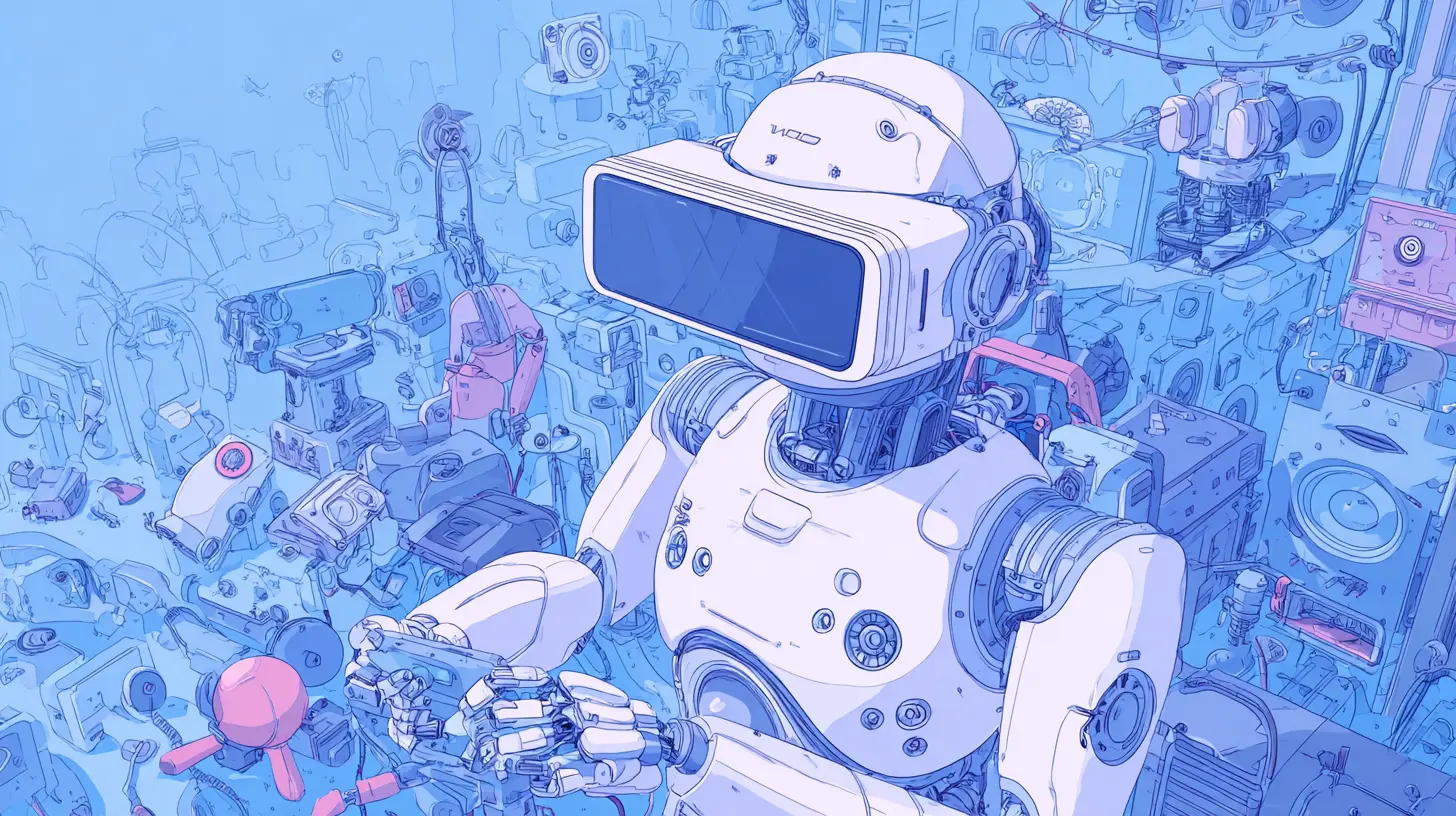
For decades, UX design focused on screens, buttons, and navigation flows. The user was the operator, and the interface was the tool. In a hyper-automated environment, that model breaks down. The user is no longer operating a system directly. They are supervising a set of autonomous processes that run in the background, make decisions, and execute actions without waiting for input.This changes the core question of UX from "how do I make this easy to use" to "how do I make this easy to trust and control." The interface becomes less about direct manipulation and more about orchestration. You are not clicking every button. You are setting parameters, defining boundaries, and stepping in only when the system encounters something it cannot handle.
Think of it like flying a modern commercial aircraft. The pilots are not constantly steering the plane. The autopilot handles the flight path, the speed, and the altitude. The pilots monitor the systems, manage exceptions, and make high-level decisions about routing and weather. The cockpit is designed for this supervisory role. It gives the pilots the right information at the right time, alerts them to anomalies, and allows them to take over instantly when needed. That is the model UX designers need to adopt for hyper-automation.
The user interface becomes a control room rather than a tool. It needs to show the state of the automated processes, the confidence levels of the AI decisions, and the points where human input is genuinely required. The worst thing you can do is present a fully automated system as a black box that either works or fails without explanation. That leaves the user helpless and distrustful.
Designing for the Exception, Not the Rule
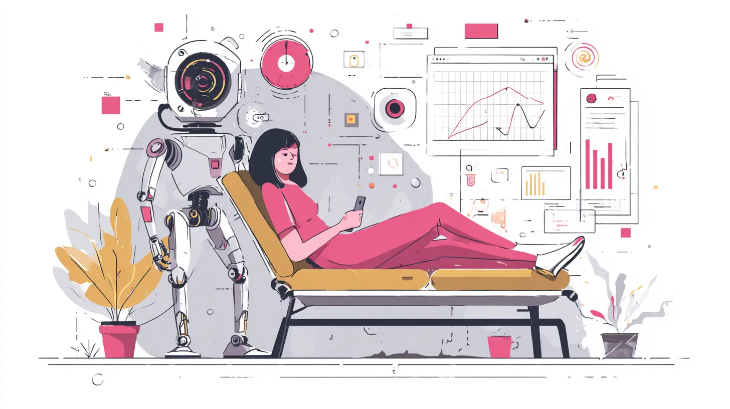
Traditional UX design optimizes for the most common user journey. You map out the happy path, then you design for edge cases. Hyper-automation flips this priority. The automated system handles the common cases perfectly. The user only sees the exceptions, the anomalies, the cases where the AI is not confident enough to act alone.This means the UX must be designed primarily for the exception. The user's entire experience with the system is defined by how well they can handle the unusual, the ambiguous, and the high-stakes situations that the machine cannot resolve. If the exception handling is clunky, confusing, or slow, the entire system feels broken, even if it works flawlessly 99 percent of the time.
Consider a loan approval process. The automated system can process thousands of straightforward applications in seconds. But a small percentage will have unusual circumstances: a self-employed applicant with irregular income, a co-signer with a foreign credit history, or a dispute on a credit report. The UX for these cases needs to be exceptional. The user needs to see exactly why the application was flagged, what information is missing, and what their options are. They need clear paths to provide additional documentation or escalate to a human reviewer.
The common mistake here is treating exceptions as failures. Designers often hide them behind technical error messages or force users through generic support flows. Instead, exceptions should be treated as a core feature. The UX should guide the user through the exception with the same care and polish as the main flow. This requires a deep understanding of the domain and the likely reasons why automation fails, which is a much harder design problem than mapping a standard form.
The Transparency Paradox
One of the biggest challenges in hyper-automated UX is transparency. Users want to know why the system made a decision, but the decision-making process is often too complex for a human to fully understand. Neural networks and ensemble models do not provide simple explanations. They operate on patterns and probabilities that are not easily translated into human-readable logic.You cannot just show the user the raw data or the model weights. That is meaningless. You need to provide what is often called an explanation interface, but the level of detail must be carefully calibrated. Too much detail overwhelms the user and destroys the efficiency that automation provides. Too little detail leaves the user suspicious and unwilling to trust the system.
The solution is layered transparency. The default view should show the outcome and a simple reason. For example, "Your invoice was flagged because the amount exceeds your typical monthly spending by 40 percent." That is enough for most users. If they want more detail, they can expand the view to see the specific data points that influenced the decision. If they need even more, they can access a technical audit trail that shows the model's confidence scores and the features that were most influential.
This layered approach respects the user's cognitive load while still providing a path to deeper understanding. It also serves different user types. A casual user just wants to know if the action is correct. A power user or an auditor wants to verify the system's reasoning. The UX must support both without forcing one on the other.
The paradox is that full transparency is often impossible. The system itself may not know why it made a decision in a way that humans can articulate. In those cases, the UX should focus on behavioral transparency rather than causal transparency. Show the user what the system did, what data it used, and what alternatives it considered. That is often enough to build trust, even if the underlying logic remains opaque.
Trust Calibration and the Automation Bias
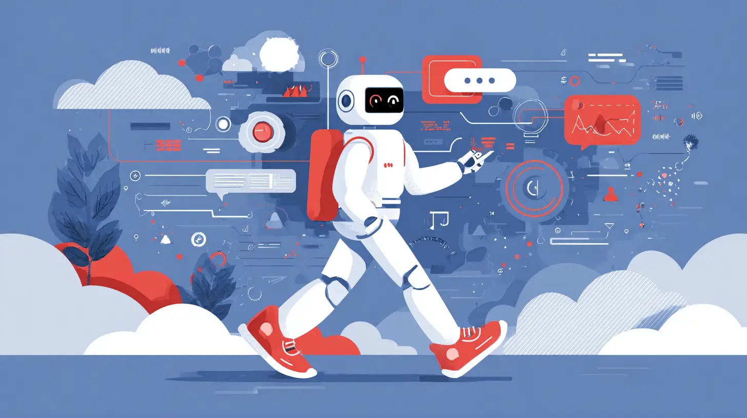
Trust is not a binary state. It is a sliding scale that shifts based on context and experience. In hyper-automated systems, you have two opposing risks. The first is automation bias, where users trust the system too much and fail to catch obvious errors. The second is automation skepticism, where users distrust the system and override it even when it is correct.The UX designer's job is to calibrate trust to match the system's actual reliability. This is harder than it sounds because reliability varies by situation. A system might be highly reliable for routine tasks but unreliable for novel scenarios. The UX needs to communicate this variability without overwhelming the user with probability estimates.
One effective technique is to show confidence indicators at the point of decision. Instead of just presenting an action, the system can show a subtle visual cue that indicates how sure it is. A green checkmark for high confidence, a yellow warning for medium confidence, and a red alert for low confidence. This allows the user to adjust their level of scrutiny based on the system's own assessment.
Another technique is to design for appropriate friction. When the system is highly confident, the action can proceed automatically with minimal user involvement. When confidence drops, the system should pause and require explicit confirmation. This creates a natural trust calibration loop. The user learns that the system is reliable when it is confident and cautious when it is not. Over time, they develop an accurate mental model of when to intervene.
The mistake many organizations make is to remove all friction from the automated process. They want the system to run end to end without any human stops. This creates a false sense of perfection. When the system eventually makes a high-impact error, the user has no context for why it happened and no practice in catching it. The UX should include deliberate checkpoints, not because the system needs them, but because the user needs them to maintain situational awareness.
The Human-in-the-Loop Dilemma
Hyper-automation often promises to remove humans from the loop entirely. But in practice, most successful implementations keep a human in the loop for complex or high-stakes decisions. The question is not whether to have a human in the loop, but how to design the interaction between human and machine so that it adds value rather than just adding delay.The classic mistake is to make the human a passive validator. The system makes a decision, then sends it to a human for approval. The human, overloaded with other tasks, rubber-stamps the decision without really reviewing it. This is the worst of both worlds. You get the cost of human labor without the benefit of human judgment.
A better approach is to design the human role as an active exception handler. The system should identify cases where human judgment adds value and present those cases with rich context. The human should not have to dig through raw data to understand the situation. The UX should present a concise summary, the key decision factors, and the potential consequences of different choices. The human's job is to apply judgment that the machine cannot replicate, such as understanding nuance, empathy, or long-term strategic implications.
This requires a shift in how we think about human labor in automated systems. The human is not a backup for the machine. The human is a specialist who handles the cases that require a different kind of intelligence. The UX should support this specialization by providing the right tools for analysis and decision-making, not just a simple approve or reject button.
There is also the question of timing. In some systems, the human must respond in seconds to prevent a failure. In others, the human has hours or days to review. The UX must be designed for the actual time constraints. A real-time system needs a streamlined interface with quick decision aids. A batch review system can afford more detailed analysis tools. Trying to use the same interface for both will fail.
Designing for the Invisible System
One of the most interesting UX challenges in hyper-automation is that the system is often invisible. It runs in the background, integrating with other systems, processing data, and taking actions that the user never sees. The user only becomes aware of the system when something goes wrong or when they need to interact with it directly.This invisibility creates a problem. Users cannot trust what they cannot see. They cannot understand what the system is doing if they never observe it in action. The UX must make the invisible system visible in a way that is informative without being intrusive.
The solution is to provide ambient awareness. The system should communicate its state through subtle signals that do not require the user's full attention. This could be a status indicator in a dashboard, a notification that summarizes recent automated actions, or a periodic digest of system performance. The goal is to keep the user informed without forcing them to constantly check the system.
For example, consider a customer service platform that uses automation to categorize and route support tickets. The agents do not need to see every ticket that the system handles correctly. But they should see a summary of the day's automated routing, including any cases that were escalated to humans. This gives the agents a sense of the system's workload and performance without overwhelming them with details.
The challenge is finding the right balance between visibility and noise. Too much visibility creates alert fatigue. Too little visibility creates blind trust or blind distrust. The UX designer must understand the user's workflow and identify the moments when information about the automated system is genuinely useful. Those moments are the ones where the UX should surface the system's behavior.
The Role of Feedback Loops in Continuous Improvement
Hyper-automation is not a one-time implementation. It is a continuous process of refinement. The system learns from its mistakes, adapts to new data, and improves over time. The UX plays a critical role in this learning process by capturing human feedback and feeding it back into the system.The design of feedback mechanisms is often overlooked. A simple thumbs up or thumbs down is not enough. The UX needs to capture the context of the feedback. Why did the user disagree with the system? What information did they have that the system lacked? What would they have done differently?
This is where the UX becomes a data collection tool. Every interaction with the automated system is an opportunity to gather information that improves the system. But the feedback must be designed to be low-effort and high-value. Users will not write a detailed explanation for every automated action. They need quick, structured ways to provide feedback that captures the essential information.
One approach is to present the user with a set of predefined feedback options. For example, "The system was correct," "The system was incorrect because it lacked context," or "The system was incorrect because the data was wrong." This gives the system useful signals without requiring the user to write a paragraph. The UX can also include a free-text field for users who want to provide more detail, but it should not be the primary mechanism.
The feedback loop also needs to close. Users need to see that their feedback leads to changes. If a user reports an error and the system continues to make the same error, they will stop providing feedback. The UX should show the status of feedback, such as "under review" or "addressed in the latest update." This creates a sense of partnership between the user and the system, which is essential for long-term trust.
The Ethical Dimension of Automated UX
Hyper-automation raises serious ethical questions, and the UX designer is often the person who has to answer them in practice. When the system makes a decision that affects a person's life, such as a hiring decision, a loan denial, or a medical recommendation, the UX must handle the interaction with care and respect.The ethical UX challenge is not just about being transparent. It is about giving the user agency. The user should be able to challenge the system's decision, request a review by a human, and understand their rights. The UX must make these options clear and accessible, not buried in a help page.
There is also the question of bias. Automated systems can perpetuate or amplify existing biases in the data they are trained on. The UX cannot fix this problem, but it can surface it. If the system detects that its decisions are having a disparate impact on a particular group, the UX should flag this to the user or the system administrator. This is not just an ethical obligation. It is also a practical one, because biased systems eventually erode trust and lead to regulatory scrutiny.
The UX designer must also consider the emotional impact of automated decisions. A rejection letter generated by an AI feels different from a rejection letter written by a human. The UX cannot change the outcome, but it can shape the tone and the framing. It can provide context, offer alternatives, and show empathy, even when the decision is negative. This is a subtle but important part of the user experience.
Common Mistakes and Misconceptions
One of the most common mistakes in hyper-automated UX is confusing automation with simplification. Just because the system is automated does not mean the user experience is simple. In fact, the opposite is often true. The user now has to understand the system's capabilities, limitations, and exceptions. The UX must be designed to manage this complexity, not hide it.Another mistake is treating the user as a passive observer. Some designers assume that because the system is automated, the user just needs to watch and wait. This ignores the fact that the user is still accountable for the system's outcomes. They need to be able to intervene, correct, and override. The UX must support this active role.
A related misconception is that more automation is always better. There are many situations where a human touch is essential. The UX should identify these situations and make it easy for the user to take over. This requires the system to know its own limitations and to communicate them clearly. A system that never asks for help is a system that will eventually fail in a spectacular way.
There is also the misconception that UX is only about the visual interface. In hyper-automation, the UX extends to the entire interaction model, including notifications, alerts, reports, and even the absence of interaction. The UX designer must think about the whole ecosystem, not just the screen.
Practical Recommendations for UX Designers
If you are designing for a hyper-automated system, start by mapping the user's entire journey, including the parts that are fully automated. Identify every point where the user might need to intervene, and design for those points with the same care as the main flow.Build a trust model. Understand what the user needs to see to trust the system, and provide it at the right moments. This will vary by user type and by the stakes of the decision. A low-stakes recommendation can be presented with minimal explanation. A high-stakes decision needs a full explanation and a clear path for appeal.
Design for exception handling as a first-class feature. Create templates and workflows for the most common exceptions, and make it easy for users to report new ones. The goal is to reduce the cognitive load of handling the unusual, not to eliminate the unusual entirely.
Use progressive disclosure for transparency. Start with the outcome and a simple reason. Allow the user to drill down into more detail if they want. Never force the user to wade through technical details to understand the basic logic.
Implement feedback loops that are easy to use and visibly impactful. Show users that their feedback matters by closing the loop with updates and changes. This builds a sense of collaboration and continuous improvement.
Finally, test with real users in real situations. Hyper-automated systems behave differently in production than in a demo environment. The UX must be tested under the actual conditions of use, including the exceptions, the time pressure, and the emotional stakes. This is the only way to know if the design truly works.
The Future of UX in an Automated World
As hyper-automation becomes more pervasive, the role of UX will only grow in importance. The systems will become more capable, but the human need for understanding, control, and trust will remain. The UX designer's job is to bridge the gap between what the machine can do and what the human needs to feel confident in the outcome.This is not a static challenge. The technology will evolve, and the UX will need to evolve with it. New interaction models, such as natural language interfaces and augmented reality, will change how users interact with automated systems. But the underlying principles will remain the same. Design for the exception, calibrate trust, provide transparency at the right level, and always keep the human in the loop where it matters.
The hyper-automated world does not have to be a dehumanized one. With thoughtful UX design, it can be a world where humans and machines work together, each doing what they do best. The machine handles the routine, the repetitive, and the predictable. The human handles the complex, the ambiguous, and the consequential. The UX is what makes this partnership possible.
all images in this post were generated using AI tools
Category:
User ExperienceAuthor:

Vincent Hubbard